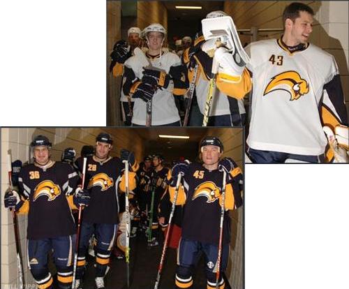
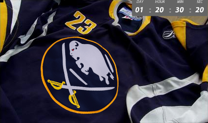
Took a trip down to HSBC Arena this morning to watch the opening practice of the Buffalo Sabres training camp, an intrasquad scrimmage and the unveiling of the new blue-and-gold uniforms featuring the much-reviled Buffalo Banana Slug. The nearly 10,000 fans in attendance were certainly excited to see their team, engaging in “Let’s Go Buf-fa-lo!” chants while the team changed into their new jerseys in the locker room.
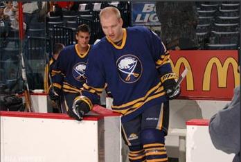
The lights went down, the spotlight lit up, and PA announcer John Gurtler encouraged fans to “welcome back your Buffalo Sabrrrrrrrrrres!!!” Everyone went nuts as the players streamed onto the ice. The lights eventually came up, giving everyone their long-awaited first look at the blue-and-golds. The reaction consisted mainly of cheers, though I think those were reserved for the guys wearing the third jersey on the ice (the throwback blue Sabre jerseys). The new unis? I have to say, I think the design is fantastic; I love the colors, and it’s a hip, new look for the team. BUT–it all falls apart with the Buffaslug on the front of the uniform. It looks ridiculous, particularly on the white away jerseys.
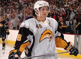
The crime of it is, slap a better logo on the fronts and I think it could become my favorite sports jersey of all time! Like I said, the color scheme is great (even the not-so-gold yellow), the number on the upper right of the front is cool and unique, and the vertical piping on the sides lend a sleek, cutting-edge look. But that damn slug. I could give in to accepting the slug if there were just some crossed sabres below it. The only sabre that does appear on the jersey is on the ‘B’ emblem on the shoulders. Not cutting it, Larry Quinn.
Quinn was sitting directly across from us at the Arena, looking smug while speaking with reporters. I can only hope the reporters were grilling him on the slug. Why he (and anyone else in the Sabres organization) thinks this logo is okay is beyond me. The original third jersey isn’t gonna cut it. I heard Quinn say on the radio, whilst I was exiting the parking ramp, that if the Sabres ever make it to a clinching game in the Stanley Cup Final, they’d be wearing that third jersey. That’s the kind of thing you have to run by the league and get permission for first; it’s not a normal occurrence. Why, Larry, would you want to have the team wearing the original jersey during the crowning moment of the franchise if you put all that time and effort into designing this new blue-and-gold disaster? Bah!
I should also mention that I got stopped before entering the arena by a girl who worked either for the newspaper or the Sabres, and asked me what I thought of the jersey. I’m not sure the remarks I gave her are suitable for print or television news. Please, for the love of God, don’t buy this crap until they fix the logo. Buy assloads of the third jersey; you can find old ones on eBay (white, too) as well.

You can find some pictures I took at the event here: Sabres 06-07 Unveiling Gallery, and some video here: Media.
Oh, one other thing. If they made this, wouldn’t you buy at least 68 of them?:
Yeah dude, we had fun without Zoda or Rott (fags ha!) fun insulting EVERYONE that was wearing the horrible Slug logo haha, that was cool…
The Sabres tried to incorporate their original emblem, but they couldn’t make it work.
“It was easier to start from scratch,” said Frank Cravotta, Sabres director of creative services. “When your old logo is such an icon, it’s hard to redo it.”
Cravotta said the Sabres evaluated about 80 logo designs before settling on one. Then there were about 12 revisions before it was finalized.
YEAH REALL TOUGH DECISION JACKASS!

Anyone know a seamstress who can make one of these for me?:

